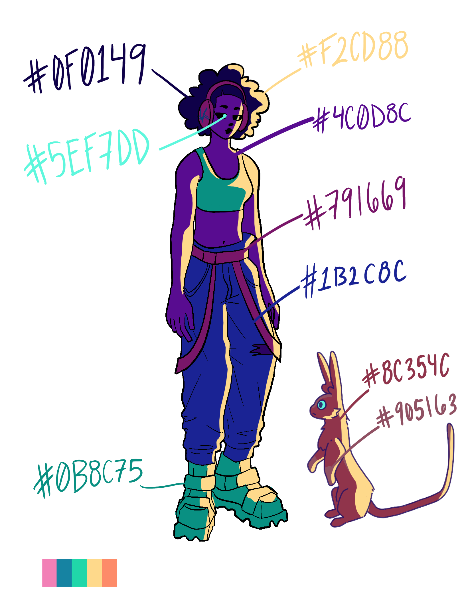
Lumion City is a mixed 2D and 3D animation loop. The subject is Karma, a girl living in
an impoverished futuristic world in which all cities/towns are shoddily built on the backs
of giant creatures known as Unreals. Karma comes into the scene and relaxes in the
sunset, observing the world around her and listening to her music with her pet. This was made in 36 hours for the SIGGRAPH Gigajam Animation Contest.
For this animation, I worked with the concept design by designing the character Karma, the storyboards, the color palette, and the credits scenes. I modeled a few minor objects in Maya, like the curved roofs. I also worked on coloring the animation for Karma.
Concept
This is the color palette I made for the overall scene using images of sunsets, lo-fi music videos, and artists that inspired me.
These were the initial character designs I had sketched out for the scene. We wanted to go for a little bit of a cyberpunk lower to middle-class style, so I experimented with these designs. We ended up choosing the top middle because it was simple, hip, and easier to animate.
This was one of the first scene layouts of the animation. I really wanted to conceptualize a sunset going on with the vibrant palette, as well as a clear sense of depth.
These were the grayscale storyboards I made for this scene. The first storyboards were the initial concept without the credits, and the second storyboards were the ones with the credits. The reason why we decided to make the credit storyboards later was because we couldn't show any credits in the original animation to remain anonymous in a contest.


This was the final colored character design for Karma. Both these images were experimentations with lighting for our scene. We went with the second one because it created more contrast and brought her out in the foreground.
These were the avatars I made for my animation team because they were amazing to work with. We included this into the credits with our names so that we could fit into the style of the final animation. The drawings also contain little shapes that are indicative of our personality and the work we contributed to.
These were the headphones I made for the final credit scene with the Texas A&M Visualization Logo. These are also the headphones that Karma wears throughout the animation.